
Please click the image to enlarge.
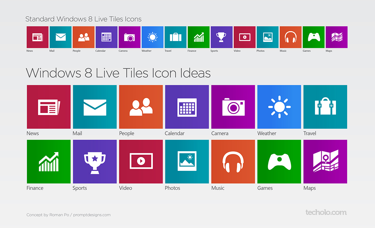
I have been using Windows 8 for a few months now and have already gotten quite used to the new Metro Modern interface. However, I had some petty issues with some of the pre-installed Live Tile Icons not really expressing very well the app and just not looking right (which I know is relative to my own liking)
So when I had an extra hour I decided to polish some of Windows 8 Modern UI Icons into what I believe is more easier to understand, simple yet still consistent with the whole idea of the Modern UI design language.
Continue reading on the next page for a brief explanation on the changes.
 |  |
| News The flap behind was just not doing it for me so I made a sharper lower corner having it look like an actual folder newspaper. | Mail Mail can’t get any simpler than an envelope. I think it works well. Just tweaked and made the flap line a little thicker. |
 |  |
| People I made the heads bigger and less rounded. Also made the shoulders look normal and not like someone with scoliosis. | Calendar Calendar just looks fine. Refined it a little |
 |  |
| Camera The camera looks a little different than the rest of the icons. So I tweaked the lens and centered it. | Weather Made the sun simpler with less rays |
 |  |
| Travel Briefcase looks fine but it can be mistaken for business attaché case. Just made the handle rounded and added straps. Though I think that it could also stand without the straps for a more simpler look. | Finance Nothing new here, but still just tweaked it along with the rest. |
 |  |
| Sports Refined the trophy and added a star because every sporting event has some sort of a star right? or I just like Mario. | Video Made the container shape a little sharper on the corners, but rounded also works great (as with all containers). Was just thinking of it as the Surface PC. |
 |  |
| Photos Less mountain tips and longer sun rays. More space on the bottom for the Polaroid-feel. | Music Adjusted the shape of the band and the ear foams. Made lines thicker. |
 |  |
| Games Couldn’t use the Xbox logo as Microsoft might be moving it to something more than “gaming”. So maybe just making the Xbox circle a little bigger. | Maps Maps icon was a little weird to look at at first. So I made a Google-like marker using the Bing Maps pin creating a focal point on the icon. |